Difference between revisions of "MediaWiki talk:Monobook.css"
Jump to navigation
Jump to search
m |
|||
| Line 13: | Line 13: | ||
::Maybe if we get HW good lookin' and ass-kicking, i can take down my original finnish hitchwiki layout and start being more uniform. :-D ([http://hitchwiki.org/fi/Etusivu check fi]) -[[User:Mikael|Mikael]] 18:44, 12 May 2009 (UTC) | ::Maybe if we get HW good lookin' and ass-kicking, i can take down my original finnish hitchwiki layout and start being more uniform. :-D ([http://hitchwiki.org/fi/Etusivu check fi]) -[[User:Mikael|Mikael]] 18:44, 12 May 2009 (UTC) | ||
| + | |||
| + | :::Hereby, I promote you be the official hitchwiki designer. :) --22:17, 12 May 2009 (UTC) | ||
Meinhard about the layout: | Meinhard about the layout: | ||
Revision as of 00:17, 13 May 2009
Looking a little festive eh? Zactalk 02:03, 5 December 2006 (CET)
- Eh? Together with amylin I'm trying to create a nicer layout. But maybe I should revert it? amylin likes the green, but I think it's hard to discern the links. But maybe I'm color blind ;) Guaka 08:38, 5 December 2006 (CET)
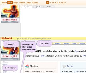
- Here is some schetching i made... Do we need all those links at the top of the page (languages) and "Signs" and such in left navi? It makes this a bit messy, lots of stuff at one view. If we need language -links at the top, they could also work in drop-selection. -Mikael 20:11, 11 May 2009 (UTC)
- I really like it. Looks much more professional than mine and guakas layouts :) The language-links are not really double. The ones at the top lead you to the main page, the ones in the sidebar to the translation of the current article. I'd say we can remove the one from the top. It looked a bit better, when we only had only 2 languages ;) --MrTweek 20:43, 11 May 2009 (UTC)
- Yeah, really looks good, but I prefer to let the language links in the top stay there, as it's easy to switch to different language wiki's when surfing hitchwiki. some time ago i already made an attemp to reduce the amount of links in the left box, maybe we can find a better solution for it. --Platschi 08:20, 12 May 2009 (UTC)
- Well, i didn't think language-bar thingy far enough. They gain their place at the top of the page, but more compact select-tag would still do the trick better. I just checked my schetch and need to say: it's looking too "clean" and therefore boring. Hitchwiki needs some kick-ass-graphics, but maybe cool logo will do that? -Mikael 18:41, 12 May 2009 (UTC)
- Hereby, I promote you be the official hitchwiki designer. :) --22:17, 12 May 2009 (UTC)
Meinhard about the layout:
- like the round corners
- don't like the airbrush art in the logo
- don't understand the jigsaw at the top
- never really liked the mediawiki thin lines around the content boxes
- bullet squares on the left look boring
