MediaWiki talk:Monobook.css
Jump to navigation
Jump to search
Looking a little festive eh? Zactalk 02:03, 5 December 2006 (CET)
- Eh? Together with amylin I'm trying to create a nicer layout. But maybe I should revert it? amylin likes the green, but I think it's hard to discern the links. But maybe I'm color blind ;) Guaka 08:38, 5 December 2006 (CET)
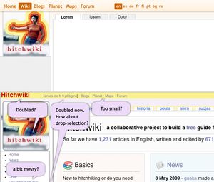
- Here is some schetching i made... Do we need all those links at the top of the page (languages) and "Signs" and such in left navi? It makes this a bit messy, lots of stuff at one view. If we need language -links at the top, they could also work in drop-selection. -Mikael 20:11, 11 May 2009 (UTC)
Meinhard about the layout:
- like the round corners
- don't like the airbrush art in the logo
- don't understand the jigsaw at the top
- never really liked the mediawiki thin lines around the content boxes
- bullet squares on the left look boring
