Difference between revisions of "Hitchwiki:Logo update"
Jump to navigation
Jump to search
m |
|||
| (7 intermediate revisions by 7 users not shown) | |||
| Line 1: | Line 1: | ||
:''From [[Talk:Main Page]]'' | :''From [[Talk:Main Page]]'' | ||
[[Image:Hitchwiki_logo_suggestion1.png|100px]] | [[Image:Hitchwiki_logo_suggestion1.png|100px]] | ||
| + | |||
| + | ==Brighter Luxemburg girl logo== | ||
This is my suggestion for a new logo - or more like logo-update. Original photo is a classic from [http://commons.wikimedia.org/wiki/Image:Hitchhiker-Luxemburg-1977.jpg commons.wikipedia], already used at current logo. Comments? - [[User:Mikael|Mikael]] 04:17, 22 June 2008 (CEST) | This is my suggestion for a new logo - or more like logo-update. Original photo is a classic from [http://commons.wikimedia.org/wiki/Image:Hitchhiker-Luxemburg-1977.jpg commons.wikipedia], already used at current logo. Comments? - [[User:Mikael|Mikael]] 04:17, 22 June 2008 (CEST) | ||
| Line 13: | Line 15: | ||
: I like the fact that it is a bit brighter and the new coloring, but prefer the original typeset --[[User:Robino|Robino]] 15:25, 31 July 2008 (CEST) | : I like the fact that it is a bit brighter and the new coloring, but prefer the original typeset --[[User:Robino|Robino]] 15:25, 31 July 2008 (CEST) | ||
| + | :: I agree with Robin. [[User:Guaka|guaka]] 10:40, 8 May 2009 (UTC) | ||
| + | ==Hand== | ||
[[Image:Hitchwiki_logo_suggestion2.png|300px]] | [[Image:Hitchwiki_logo_suggestion2.png|300px]] | ||
| Line 22: | Line 26: | ||
Hi everyone again! I've put some time to re-think Hitchwiki's logo design. What do you think about results? -[[User:Mikael|Mikael]] 02:55, 15 March 2009 (UTC) | Hi everyone again! I've put some time to re-think Hitchwiki's logo design. What do you think about results? -[[User:Mikael|Mikael]] 02:55, 15 March 2009 (UTC) | ||
:Looks good, but quite a radical change :) --[[User:MrTweek|MrTweek]] 14:35, 15 March 2009 (UTC) | :Looks good, but quite a radical change :) --[[User:MrTweek|MrTweek]] 14:35, 15 March 2009 (UTC) | ||
| + | |||
| + | :I think it's a bit too darkish, I prefer the existing logo. [[User:Guaka|guaka]] 10:40, 8 May 2009 (UTC) | ||
| + | |||
| + | :I think its cool...The second one is my favorite. [[User:peacehead|peacehead]] | ||
| + | |||
| + | :In Czech Republic the thumb this way, not pointing straight up, has an ambivalent meaning. --[[User:Fverhart|Fverhart]] 18:27, 25 June 2009 (UTC) | ||
| + | |||
| + | :The hand needs to look more dynamic. But it's a point that the thumb is not understood in the same way everywhere. Apart from that, I like it. --[[User:Kb|Kb]] 00:03, 3 August 2009 (UTC) | ||
| + | |||
| + | ==Next thingy== | ||
| + | I'm thinking new ideas for the logo, all suggestions are helpfull and appreciated. I might come up with something new in few weeks. -[[User:Mikael|Mikael]] 19:11, 12 May 2009 (UTC) | ||
| + | |||
| + | ==More?== | ||
| + | :''[[Special:Upload|Upload your ideas]] and add them here.'' | ||
| + | [[Category:Project:Hitchwiki Design]] | ||
Latest revision as of 07:15, 30 April 2011
- From Talk:Main Page
Brighter Luxemburg girl logo
This is my suggestion for a new logo - or more like logo-update. Original photo is a classic from commons.wikipedia, already used at current logo. Comments? - Mikael 04:17, 22 June 2008 (CEST)
- Hmm, lady needs some tweaking on the borders of red line and photo, but i'll fix it later. :-) -Mikael 05:21, 22 June 2008 (CEST)
- Good idea that I would like support and nice new version. However, I would prefer a non-retro logo... --Alex 19:20, 23 July 2008 (CEST)
- I'm fine with anything. Just move this discussion to a new page, e.g. project:Logo update and put some variations in there. guakasite, wikitalk 20:22, 24 July 2008 (CEST)
- I also like it. But a little less retro would be cool for me, too --MrTweek 14:08, 31 July 2008 (CEST)
- I like the fact that it is a bit brighter and the new coloring, but prefer the original typeset --Robino 15:25, 31 July 2008 (CEST)
- I agree with Robin. guaka 10:40, 8 May 2009 (UTC)
Hand
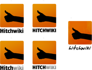
(Click image to enlarge.)
Hi everyone again! I've put some time to re-think Hitchwiki's logo design. What do you think about results? -Mikael 02:55, 15 March 2009 (UTC)
- Looks good, but quite a radical change :) --MrTweek 14:35, 15 March 2009 (UTC)
- I think it's a bit too darkish, I prefer the existing logo. guaka 10:40, 8 May 2009 (UTC)
- I think its cool...The second one is my favorite. peacehead
- In Czech Republic the thumb this way, not pointing straight up, has an ambivalent meaning. --Fverhart 18:27, 25 June 2009 (UTC)
- The hand needs to look more dynamic. But it's a point that the thumb is not understood in the same way everywhere. Apart from that, I like it. --Kb 00:03, 3 August 2009 (UTC)
Next thingy
I'm thinking new ideas for the logo, all suggestions are helpfull and appreciated. I might come up with something new in few weeks. -Mikael 19:11, 12 May 2009 (UTC)
More?
- Upload your ideas and add them here.

